Cocoroco
Visual identity for CX talent platform

Cocoroco is an online talent marketplace inspired by the remote lifestyle. They developed a platform to make hiring for remote customer service positions quick, simple, and honest – for companies looking to hire and professionals looking to work from home.
I was commissioned by North-East to assist in developing a new brand positioning for 5CA. I was tasked with creating a new visual identity for the 5CA spin-off: Cocoroco.

The lens on talents
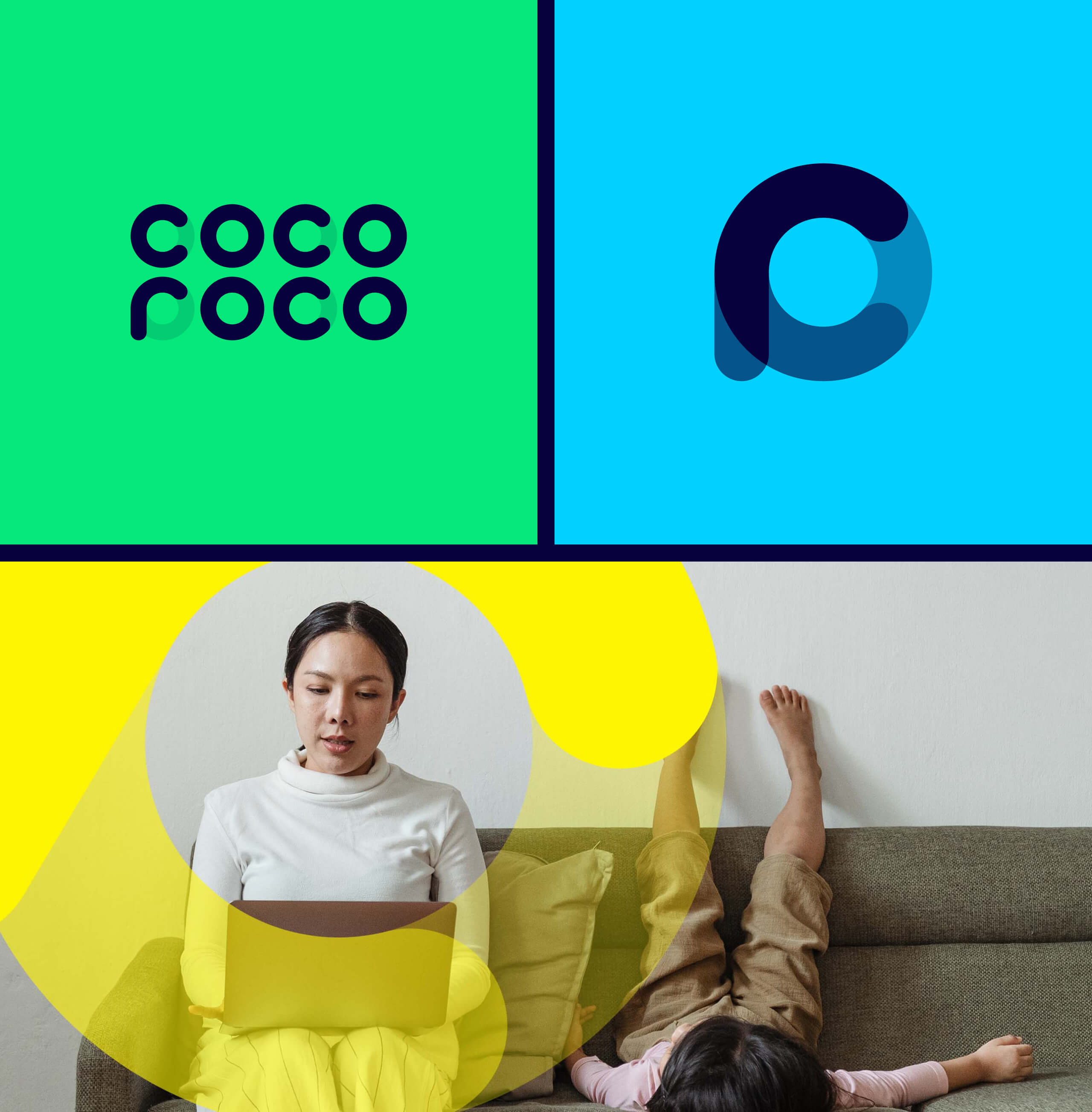
The name 'Cocoroco' is unique as it alliterates and has a memorable factor. In addition, the wordmark is notable as all three letters can be constructed from a circle, which is a recurring element in the brand identity and serves as a symbol of 'the lens on talents'.

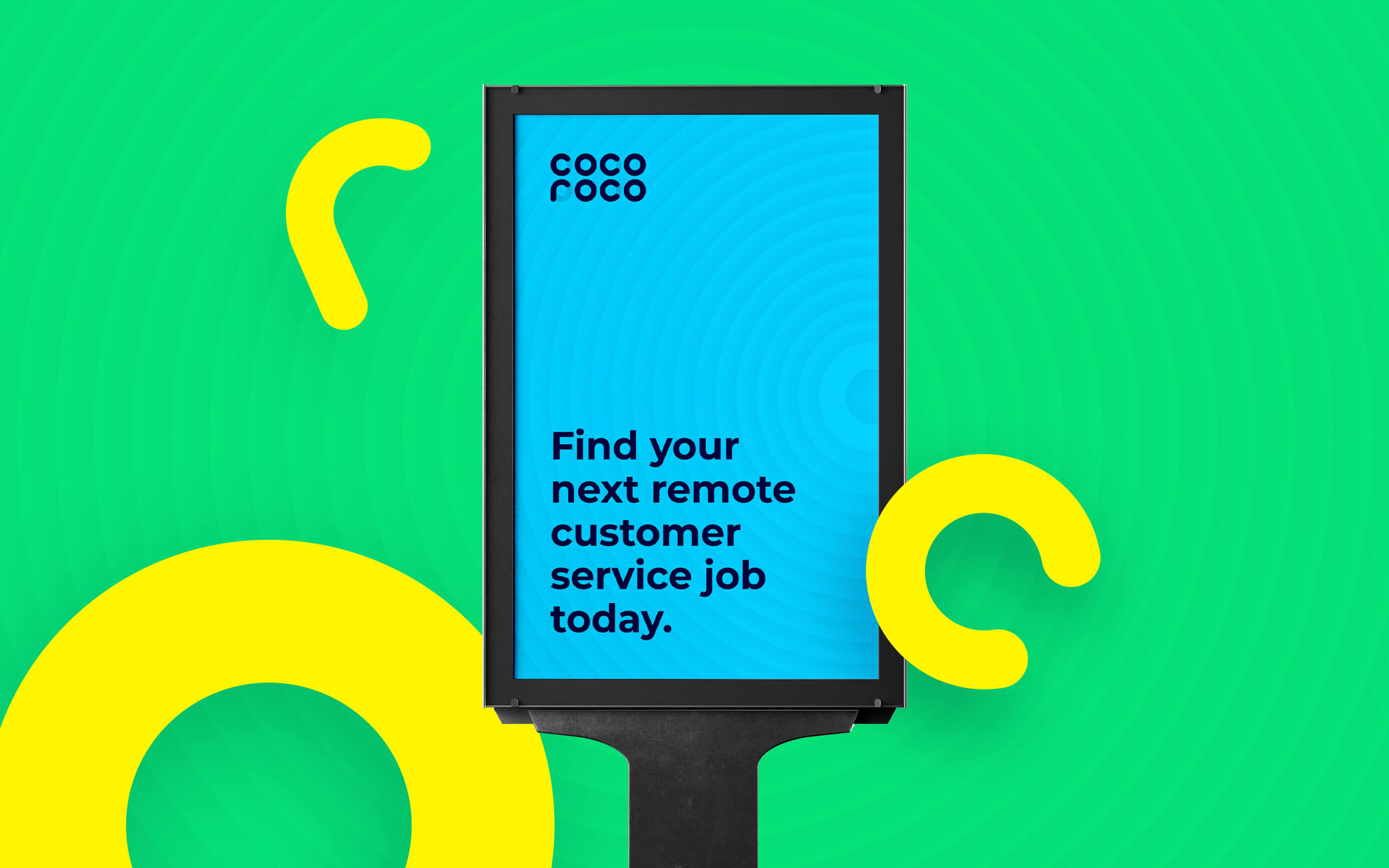
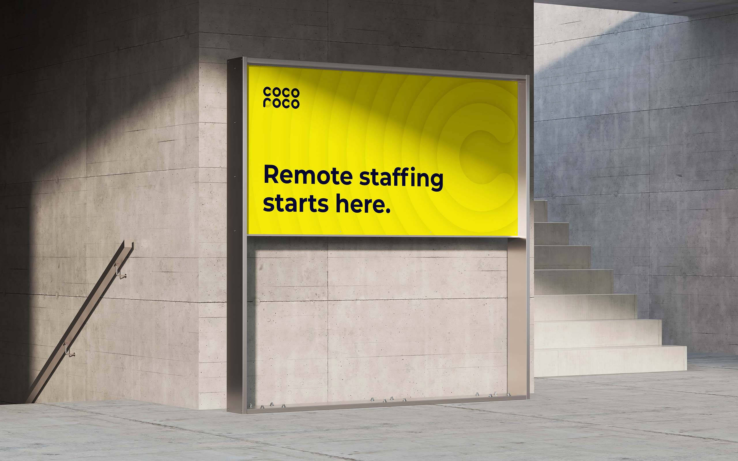
The color scheme represents freshness: green field, blue sky, and yellow spirit. These colors are used consistently throughout the brand's visual identity, from the logo to the website and marketing materials, to create a cohesive and recognizable brand image.

The recurring letters
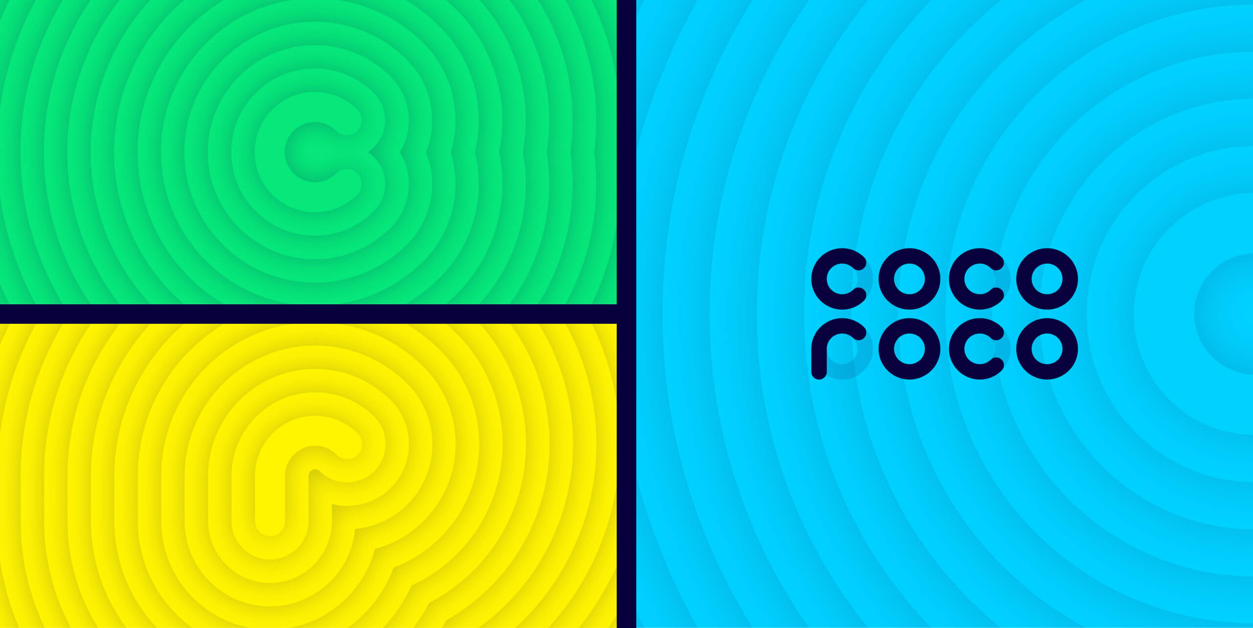
The patterns built up from the three core letters C, O, and R provide dynamism and depth to the visual style of Cocoroco. The patterns follow the letters' curves and use the three bright colors from the color palette.

